I’m thinking about book covers.
Gil takes the jacket off pronto and reads the book naked. The paper covers float arouind the Cabin like disembodied spirits until we remember to replace them.
My editor at Viking was nice enough to ask me for early weigh-in, for ideas as they develop the cover for Savage Girl, my novel which is just now going into production (it’ll be out next winter). My editor did not have to do that. Tradition dictates that authors are owed a consult on the cover, no more. And my last two experiences with jacket art at Viking have been so superb that I trust them implicitly.
But since he asked, I’m thinking about book covers.
The hardcover of The Orphanmaster amazed me because it incorporated period graphics that I thought you’d really have to be an expert to be aware of.

Someone did their homework. On the back flap is fine print that enumerates the images that appear here as a fantastic collage: (hand, detail) Pieter van Miereveld, The Bridgeman Art Library/Getty Images; (background) View of New York by Johannes Vingbooms, c. 1664, LOC[accession numbers follow]; (foreground) Moonlight Scene, Southampton, 1820 (oil on canvas), Sebasion Pether/The Bridgeman Art Library/Getty Images. The type’s so small I might have got some of this wrong, but suffice it to say the designers did their homework and the result is seamless and just the right degree of spooky, with its moonlit view of a haunted, tiny New Amsterdam on the tip of Manhattan island so, so long ago.
I always loved that evocation. Then, looking into it a little further, I found out the designer responsible is actually a cover art magician by the name of Gregg Kulick, who has jacketed dozens if not hundreds of books, for various publishers. And is just really smart. He was straightforward when the Huffington Post asked him to name the most important element of a successful book cover: “Getting people to pick it up.”
I also think highly of the cover for The Orphanmaster’s upcoming softcover edition (out April 30).

As an author, I feel so lucky. To me this design holds just the right balance of sweetness and terror, with the little girl’s rosy face and the skull hovering over her shoulder. I’m hoping it will attract some readers who didn’t get a chance to check out the novel the first time around. Bookclubbers, especially who wait for the softcover to pounce.
An interesting place to check out cover ideas is the web site Talking Covers, where authors and jacket designers hold forth on the development of the art for a particular book. The depth of the discussion can be really astonishing. I looked around here, and also at books on the web at the Book Cover Archive and at Amazon and found it was hard to imagine what might be a starting approach for Savage Girl. Historical fiction, yes, murder mystery, yes, and it takes place in New York during the Gilded Age – all strong features of the book. But what images could get across my story so that a reader would, as Kulik said, “pick it up”?
I found myself liking covers with bold, striking colors, semi-abstract.
Vampires in the Lemon Grove, for example, by Karen Russell.

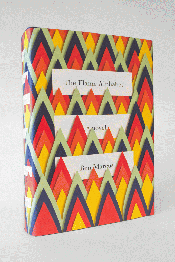
Or Ben Marcus’ The Flame Alphabet.
But did these and other disparate, attractive books have any bearing on what should design should clothe Savage Girl?
Back in the day, books did not have jackets. You would buy pages bound with cardboard – then bind the volume yourself with leather. When Fanny Trollope came out with her famous 1832 book that lampooned the United States, Domestic Manners of the Americans, London booksellers offered it in two parts, one red, one blue, cloth-bound in the latest fashion, with gilt titling on the spine. It had a huge first run printing of 1,250. Reviews in England were great, those in the U.S. stunk, and Fanny shot to the top of the bestseller list. Perhaps aided by those chic cloth covers?
I like cloth, still. Some nearly naked volumes are my favorites, like The Goede Vrouw of Mana-ha-ta, by Mrs. John King Van Rensselaer, published by Scribner’s in 1898.

With an especially beautiful spine.

(My volume was formerly loved as a library book.)
Or, more recently, Magnus Nilsson’s Faviken, its cloth stamped with black flora and fauna.

Cloth or paper-bound, though, a book should jump into your hand from the bookstore shelf. It should warm your lap as you read it; it should purr. A book jacket has to live.
Whether I go to my editor proposing a pearly satin debut gown or a bloody pawprint — two images that pop into my mind when I think of the Savage Girl story–my ideas on their own won’t make much sense. What matters is your designer, your brillant designer of book jackets, and whatever blooms in his head.